Marketing Dashboards That Drive Decisions: The KPI Framework for 2026
Most marketing dashboards report activity instead of guiding decisions. Learn how to build KPI dashboards for acquisition, retention, attribution, and executive reporting.
Most marketing dashboards are dashboards in name only. They collect numbers, decorate them with charts, and still fail to answer the only question that matters: what should we do next?
A useful dashboard is not a data dump. It is a decision system. It shows whether the business is on track, where performance is changing, which levers matter, and what tradeoffs leadership needs to make. In 2026, with fragmented attribution, AI-assisted reporting, privacy constraints, and more channels than ever, that discipline matters more than the tool you use.
The Dashboard Problem
Marketing teams usually inherit reporting from three places: platform dashboards, analytics tools, and executive requests. The result is a messy collection of metrics that answer different questions with different definitions.
Common problems:
- too many metrics and no hierarchy
- platform-reported conversions treated as truth
- no separation between leading and lagging indicators
- no view of contribution margin or payback
- no explanation of what changed and why
- dashboards built for reporting, not decisions
A better dashboard starts with the decision, then works backward to the metric.
Before building anything, write a one-sentence purpose for the dashboard: “This dashboard helps [owner] decide [decision] every [cadence].” If you cannot finish that sentence, the dashboard will become a graveyard of interesting numbers.
The Four Dashboard Layers
Every growth team needs four reporting layers.
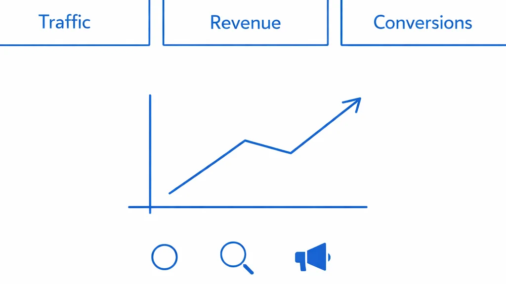
1. Executive dashboard
The executive dashboard answers: are we growing profitably?
It should be simple, stable, and tied to business outcomes. This is not where you show every campaign metric.
Core metrics:
- revenue or pipeline
- gross margin or contribution margin
- marketing spend
- customer acquisition cost
- payback period
- new customers or qualified opportunities
- blended ROAS or MER
- retention or repeat purchase rate
The executive dashboard should make tradeoffs visible. If revenue is growing but payback is stretching, leadership needs to know. If CAC is improving because spend has been cut too aggressively, that also matters.
2. Acquisition dashboard
The acquisition dashboard answers: where is efficient new demand coming from?
This dashboard should separate channels but avoid pretending that every platform’s attribution is comparable. Meta, Google, TikTok, LinkedIn, retail media, affiliates, and email all report differently.
Useful metrics:
- spend by channel
- new customers or qualified leads
- cost per acquisition
- conversion rate by funnel stage
- landing page performance
- creative or keyword concentration
- new vs returning customer mix
- impression share or reach where relevant
For B2B, include lead quality and pipeline progression. For ecommerce, include new-customer revenue and contribution margin.
3. Retention dashboard
The retention dashboard answers: are customers becoming more valuable over time?
Too many marketing dashboards stop at acquisition. That is dangerous because acquisition looks better when retention is ignored.
Track:
- repeat purchase rate
- cohort revenue
- churn or cancellation rate
- LTV by acquisition channel
- email/SMS revenue by segment
- subscription retention or reorder timing
- product/category expansion
Retention data changes how you judge acquisition. A channel with higher CAC can be more profitable if it brings better customers.
4. Experiment dashboard
The experiment dashboard answers: what have we learned?
This is where marketing becomes a compounding system. Track tests, hypotheses, outcomes, and decisions.
Include:
- test name
- hypothesis
- channel or funnel stage
- start/end date
- primary metric
- result
- decision: scale, iterate, stop, retest
- learning summary
Without this layer, teams repeat the same tests and call it iteration.
Metric Hierarchy: North Star, Drivers, Diagnostics
Good dashboards organize metrics by hierarchy.
North Star metric
This is the primary business outcome marketing is trying to influence. It might be revenue, qualified pipeline, new customers, or contribution margin.
Driver metrics
These are the controllable levers that move the North Star:
- spend
- traffic
- conversion rate
- average order value
- lead-to-opportunity rate
- win rate
- repeat purchase rate
Diagnostic metrics
These explain why drivers changed:
- CPM
- CTR
- CPC
- landing page speed
- frequency
- creative fatigue
- email open/click rates
- search impression share
Diagnostic metrics are useful, but they should not dominate executive reporting. A CEO does not need ten CTR charts. A media buyer does.
The KPI Framework
Use this framework to decide which metrics belong where.
| Business Question | Primary KPI | Supporting Metrics |
|---|---|---|
| Are we growing? | Revenue, pipeline, new customers | traffic, leads, orders |
| Are we growing profitably? | CAC, payback, contribution margin | ROAS, MER, AOV |
| Where should budget move? | marginal CAC, incrementality, channel payback | spend, reach, conversion rate |
| Is performance durable? | retention, repeat purchase, cohort LTV | churn, reorder rate |
| What should we test next? | test win rate, learning velocity | creative fatigue, funnel dropoff |
If a metric does not support a decision, remove it or move it to a deeper diagnostic view.
Define Metrics Before You Visualize Them
Most dashboard fights are definition fights. Resolve them before design starts.
| Metric | Clean Definition | Common Trap |
|---|---|---|
| CAC | New-customer acquisition spend / new customers acquired | Mixing returning customers into acquisition |
| MER | Total revenue / total marketing spend | Treating it as a channel-level optimization metric |
| Payback period | Time until gross profit covers acquisition cost | Calculating on revenue instead of margin |
| Contribution margin | Revenue minus variable costs and marketing spend | Ignoring discounts, shipping, payment fees, or COGS |
| Pipeline CAC | Marketing spend / qualified pipeline or opportunities | Counting unqualified leads as demand |
| Marginal CAC | Cost to acquire the next incremental customer | Assuming average CAC stays true as spend scales |
A dashboard with imperfect data and clear definitions is usually more useful than a beautiful dashboard where every team interprets the metrics differently.
Attribution: Use Multiple Views
No single attribution model is enough. Platform attribution is biased toward the platform. Last-click underweights discovery. Multi-touch models can look scientific while being fragile. Marketing mix modeling requires enough data and good assumptions.
The practical solution is triangulation.
Use:
- platform data for optimization within channels
- GA4 or analytics data for onsite behavior and last-click patterns
- CRM/order data for business truth
- incrementality tests for causal evidence
- blended metrics for executive sanity checks
- MMM where spend and data maturity justify it
When these views disagree, do not panic. Ask why. Disagreement often reveals the most useful insight.
Blended Metrics Matter
Blended metrics cut through attribution noise.
For ecommerce, use Marketing Efficiency Ratio:
Total revenue / Total marketing spend
For B2B, use pipeline or revenue per marketing dollar:
Qualified pipeline / Total marketing spend
Blended metrics are not perfect. They can hide channel-level problems. But they are excellent for understanding whether total marketing pressure is translating into business outcomes.
Build Dashboards Around Cadence
A dashboard should match the rhythm of decision-making.
Daily:
- spend pacing
- revenue/leads/orders
- site or tracking outages
- major anomalies
Weekly:
- channel performance
- creative fatigue
- funnel conversion
- experiment decisions
- budget shifts
Monthly:
- CAC and payback
- cohort trends
- attribution comparison
- forecast vs actual
- strategic allocation
Quarterly:
- channel portfolio review
- incrementality learnings
- LTV and retention analysis
- budget planning
- strategic bets
If a metric changes daily but decisions happen monthly, do not overreact to daily noise.
Use thresholds to separate noise from action. For example: alert on tracking outages immediately, review CPA swings only after enough conversion volume, and escalate payback changes when they affect cash planning. The dashboard should reduce panic, not manufacture it.
The Dashboard Stack
The exact tools matter less than the data model. A practical stack includes:
- data warehouse or clean central source of truth
- connectors for ad platforms, analytics, CRM, and ecommerce data
- transformation layer with consistent definitions
- BI tool for visualization
- alerting for anomalies
- written commentary for interpretation
The written layer is underrated. A dashboard that says “CAC increased 18% because Meta frequency rose and two winning creatives fatigued” is far more useful than a chart alone.
Every important dashboard should have a short spec:
- owner
- audience
- decision cadence
- source tables
- metric definitions
- refresh frequency
- known data limitations
- action thresholds
- last updated date
This turns reporting from a screenshot culture into an operating system.
Common Dashboard Mistakes
Reporting platform ROAS as business truth
Platform ROAS is useful for in-platform optimization. It is not the same as incremental revenue.
Mixing new and returning customers
Acquisition efficiency is meaningless if returning customers are included as if they were newly acquired.
Ignoring margin
Revenue without margin can create false confidence. If discounts drive conversion but erase profit, the dashboard should show it.
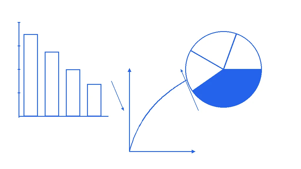
Too many charts
More charts usually mean less clarity. The best dashboard is often the one that removes noise.
No owner
Every metric needs an owner. If nobody is responsible for acting on a metric, it is decoration.
No commentary
Dashboards show what happened. Teams still need interpretation. Add a weekly written summary with the cause, impact, decision, and owner for each important change.
A Better Weekly Marketing Review
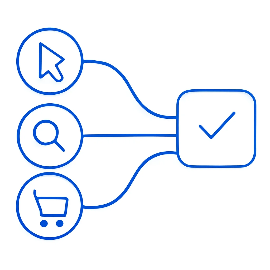
Use the dashboard to run a sharper meeting.
- What changed since last week?
- Was the change meaningful or noise?
- Which metric explains the change?
- What action are we taking?
- What test or decision should be logged?
- Who owns the next action, and by when?
This turns reporting into operating rhythm. The dashboard is not the meeting. It is the evidence the meeting uses.
The Bottom Line
Marketing dashboards should not exist to prove that work happened. They should help teams make better decisions faster.
The best dashboards in 2026 will combine business outcomes, channel diagnostics, attribution triangulation, retention data, and experiment learning. They will be simple at the top and detailed underneath. Most importantly, they will make the next action obvious.
Key Terms in This Article
CPM
Cost Per Mille (thousand impressions) – what you pay for 1,000 ad views.
CPC
Cost Per Click – the amount you pay each time someone clicks your ad.
CPA
Cost Per Acquisition – how much you pay to acquire one customer or conversion.
CTR
Click-Through Rate – the percentage of people who click your ad after seeing it.
ROAS
Return On Ad Spend – revenue generated for every dollar spent on advertising.
LTV
Lifetime Value – the total revenue a customer generates over their entire relationship.
Related Articles
Marketing Metrics That Actually Drive Growth: The Complete 2026 Guide
Impressions and clicks don't pay the bills. Here are the 15 metrics that actually predict revenue growth—and how to track them without drowning in data.
Attribution Modeling Guide: Multi-Touch That Makes Sense
A practical guide to multi-touch attribution: model types, when to use each, and common mistakes that distort budget decisions.
Marketing Mix Modeling in 2026: The Privacy-First Attribution Method That Actually Works
As cookies disappear and platform reporting becomes less reliable, Marketing Mix Modeling (MMM) is making a comeback. Here's how to build a modern MMM practice, what it can and can't tell you, and how to use it alongside incrementality testing.
Need help turning this into a system?
Wieldr works with selected teams on strategy, paid media, measurement, creative testing, and AI-native marketing workflows.
Work with Wieldr